Feeling femtech – one of my most difficult projects
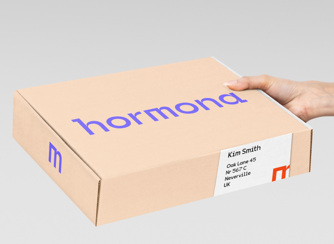
Hormona is a company, that provides at-home hormonal test kits for their female customers.
We were in the middle of the pandemic when the owners approached me. Providing these kits was relevant as ever. I found this project challenging because there was a lot of uncertainty on the table. The strategy workshop didn’t go as to the point as I hoped. There were still a lot of vague elements on the table I had to work with. This identity ended up being a bit simpler, showing finesse and nuances in the details.
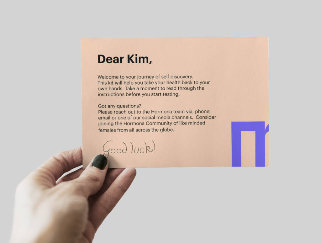
The topic of hormonal self-tests is sensitive. The receivers of the kits are likely in a heightened emotional state – being curious or anxious about their results. As a response to this, I aimed to build an identity that is subtle, reassuring, and comforting. I wanted to avoid looking too medical – as some of the competitors do – so I took a direction toward ladylike, but not over-the-top feminine.
The founders were proud of the technological invention behind the analysis of the results. However, they did not want to go into boring details. The identity carries a slight touch of technology.
Division=Together
So you might wonder, what happens when you have to bring the subtle feminine, and the technological together?
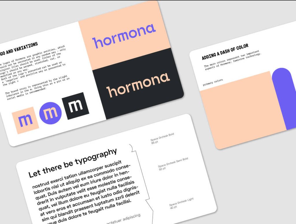
I started with carefully crafting a logo, that checked all the boxes. Workwith with a strong duality, the logo is subtly divided in half. Until midway the letterforms are modified to rectangular. At 3,5 characters, in the middle of the ´m’ the switch happens to feminine with mainly rounded shapes. These details would be perhaps too subtle would colors not support the same story. The subtle pink background color represents care, softness and the female. Pairing with a vibrant purple often used by tech companies the combination is unique.
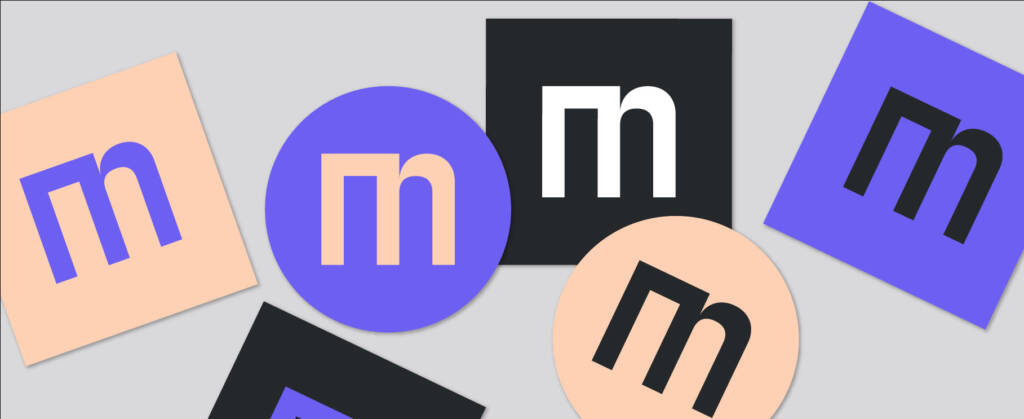
The ‘m’ bringing both of the sides together became the most characteristic letter of the logo. Therefore we chose it to be the thumbnail of the brand.
What seemed to be a difficult task at the beginning was coming together nicely in the brand book.
What appeared to be possible visually, was another question when it comes to tone of voice. Trying different ways, imagining to ‘speak’ to Hormona’s customers, I neared the solution. Their language became suggestive, soft-spoken, polite and understanding. Like an experienced nurse, if you’d ask them, they would confidently answer on the most understandable way – without confusing you with jargon or wordy expressions. Again, sharp, not too emotional, yet trustworthy and allowing – as the whole brand turned out to be.