
A brand with a biiig emotional baggage
Abraso is a brand creating beautiful bras for the survivors of breast cancer – and mastectomy.
The founder tasked me to create a brand that speaks the language of these incredibly strong women.
Market research showed clearly that all labels out there are solely focused on the medical aspect of the topic. Their bras were merely functional – no colors, maximum coverage – presented on perfect bodies models.
Flipping the emotional switch
All these producers missed a crucial step. Thinking about their customers. Sketching up a user persona, I saw strong, wonderful ladies. They overcame a deadly disease, emerged healthily, and are ready to take on other challenges. Instead of looking at their bodies with shame, and hiding them, we should be proud of them and celebrate them. We should embrace (abraso in Spanish) their uniqueness, their story, and their bodies with the best we can. We should acknowledge their medical history – but not reduce them to it.
This emotional re-mapping resulted in what later became Abraso.
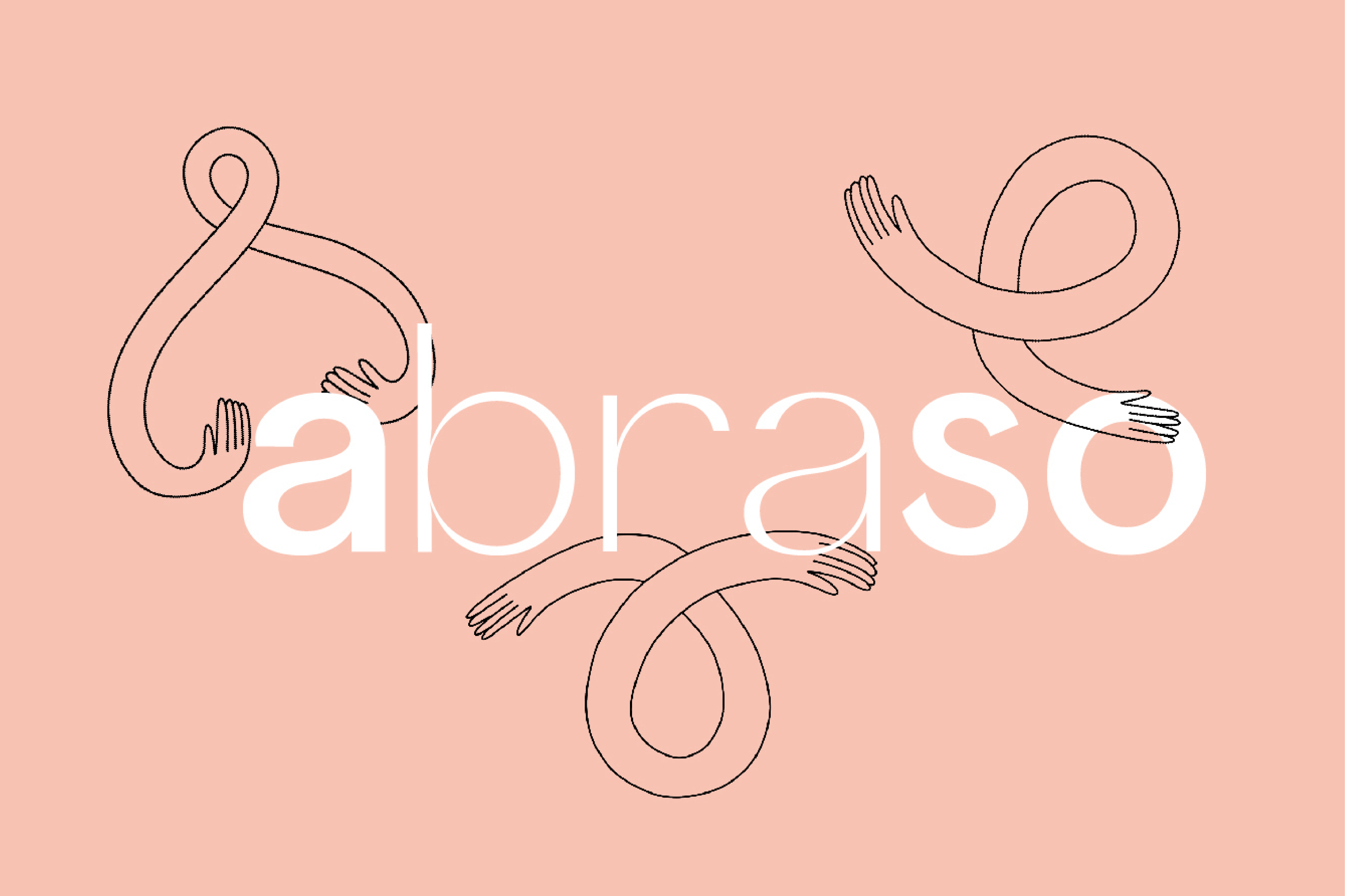
Celebrating uniqueness and diversity does not go without having a logo expressing it. In Abraso’s case, I found a dynamic logo system the best answer – with two main static expressions.

The user persona is very specific in one aspect but broad and inclusive in the other was challenging to match with other branding elements. Therefore, the tone of voice addresses the fierce survivor, the eternal Woman, acknowledging her power but being kind, empathic, and supportive at the same time.
By the tone of voice, I mean visual voice as well. The color palette is vibrant, feminine, sexy and full of life with some grounding elements. It was a pleasure to develop the palette together with the owner-the designer of these supportive and cheeky bras.

The base value of the brand is represented by the chosen typography – a truly versatile, variable font is applied to all communication materials. Where needed – it is extravagant and asks for attention – while in other places it gives a pleasant reading experience.
Illustrative style
After the brand book was established, we decided to continue working together, and expand the communication materials of the brand.
Her vision was to make the brand even more relatable to its customers. Having a unique illustrative style is a good tool for that. We came to a natural, bright, cheeky, powerful – somewhat raw collection of illustrations. It was wonderful to see how every pixel spoke the same language – supporting the mission and vision.
These illustrations were put to use in many places. They became a refreshing addition to the social media grid, the packaging material, and the website.
Developing a brand mascot
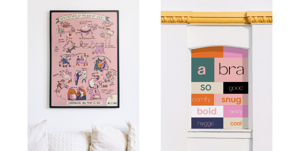
When the owner was looking for sustainable, unique, and pleasant packaging, I offered her to develop a wrapping paper. Instead of slapping her logo in a pattern generator and sending it to print we set out to create something significantly more meaningful.
The analogy of a camel came to mind based on the customer’s stories. I sketched up a camel called Bubi, with oddly sized humps. The wrapping paper became a huge poster – with an illustrated cartoon of her hero’s journey. The initially shy and self-conscious Bubi is meeting different camels in all shapes, sizes, and colors, living their best life – no matter their humps. At the end of the cartoon is Bubi coming to acceptance with herself and enjoying her life confidently.
Together with the rest of the illustrations, Bubi became an important part of the brand.
The important bits
Abraso could have been one of the medical brands on the market. We chose to make them more with emphasizing emotions. Their brand values got a straightforward expression in their logo(s). Telling their story became easier with a brand mascot.
Abraso was a long-run project, with more than a branding stage. The owner was engaged and invested in the development of the brand – contributing a great deal with insights, precise briefs and constructive feedback.