Finding an expression for a dynamic brand
Modulo’s founder approached me to give form to his already successful business. He came with a great name – describing precisely what he was doing.
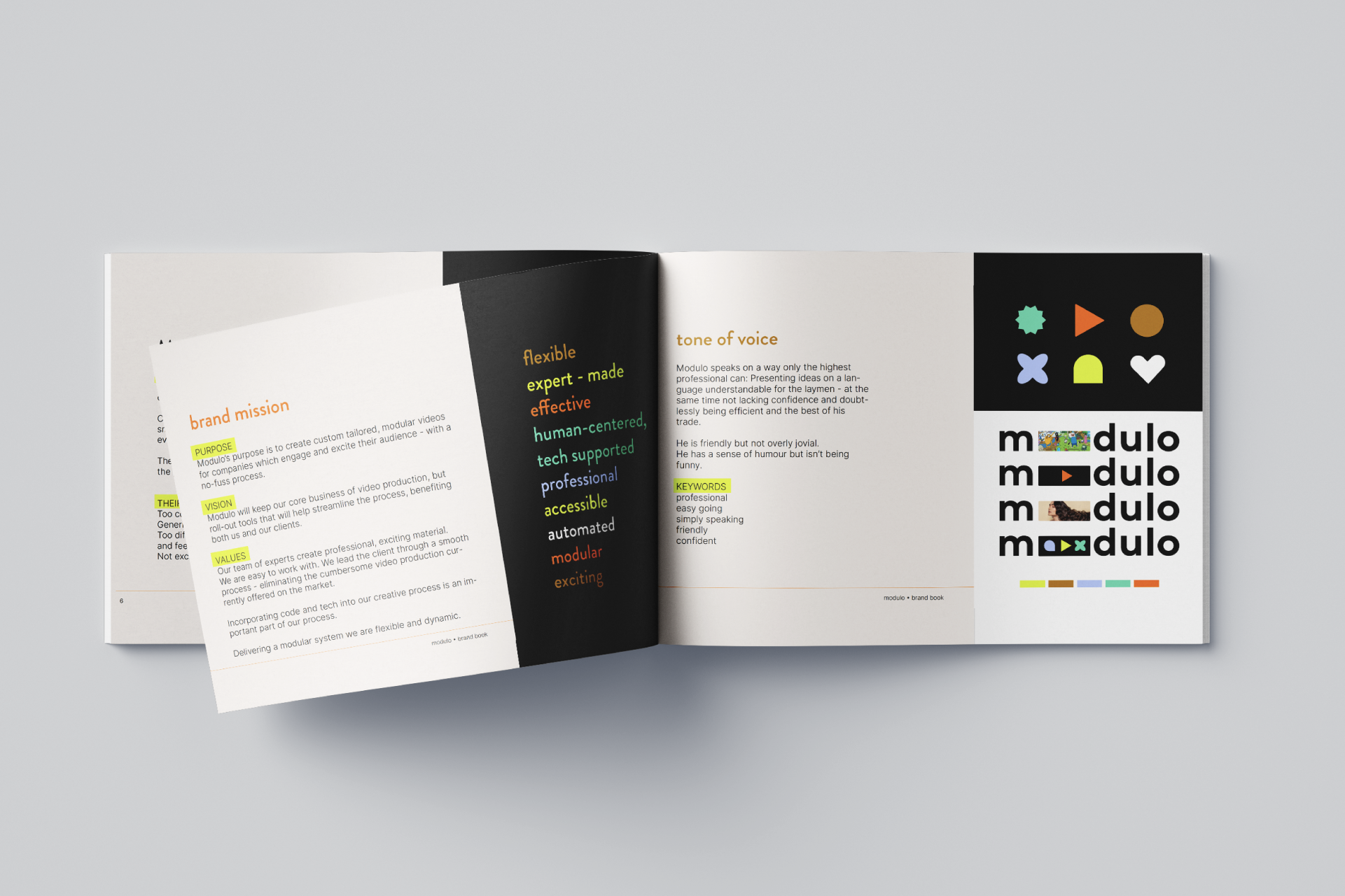
Modulo creates modular video content for their clients in many variations – some parts were automated, while they were also enriched with human touch and creativity. His proposal is unique among his competitors – we just had to find the pivotal visuals.
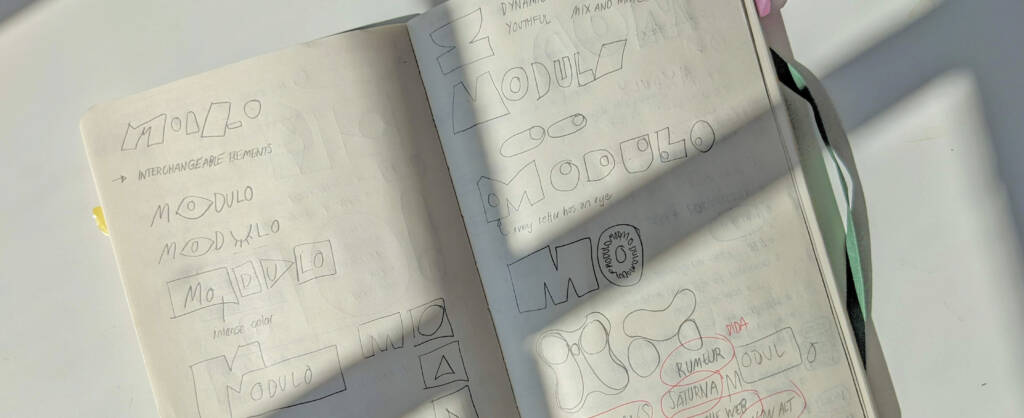
When building up the first concepts, I considered many directions from the fluid and modular to the puzzle-like – making sure that all of them are easily translatable to a dynamic identity. These first visual concepts always highlight a different angle of the business – and help deepen the understanding of the business. After considering all these aspects, we moved on with a simple yet telling logo.
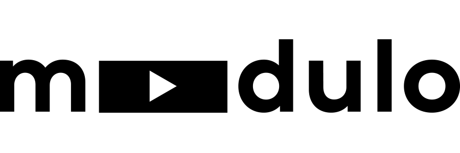
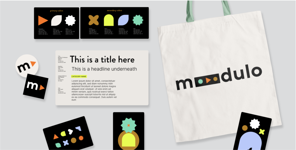
The middle part represents a screen – where building-block-like modular shapes can appear, shift, and change. On the primary logo, the central shape is a triangle – referring to a play button on a video. Additionally, the logo is a hint to the video-editing interface – sequencing – as well. Bringing the concept further, the screen can be filled with anything – based on the wishes and needs of modulo’s clients.
Assembling the color palette was exciting – the founder explicitly asked to be daring and unique. I chose to set the palette on a dark background – and added colors glowing like a screen in a dark room.

The shapes used in the logo became building blocks for an illustrative style. During an intense brand day, there is usually no time to get into the details – however, I’m always happy to guide my clients further if they wish after the brand core is done.
Eventually, I had a couple of candidates for the typography. Modulo’s founder chose a semi geometric-yet handmade option as a go-to font. Branding Grotesque exactly expressed the duality of his company – including AI, and very human creativity and craftsmanship as well.
The challenge
The challenge and the benefit lay in the two-sidedness of Modulo. Being highly technological yet preserving the creative and artistic is hard to express in visual terms. Mixing the sharp and artificial with playfulness and a wildly rough approach worked well in their case. But as with every project, this solution is only fitting them, a unique company with huge potential.