Hypergrowth makes for one of the best reasons to go through a rebrand.
While the Hair Growth Lab team was busy setting up systems to accommodate the influx of students, I got to update the brand that would appeal to them.
Starting off with a brand audit we got on the same page about the past and future of the brand. We set up priorities based on actionable insights on what went well and what could be improved. My position as a design lead required reporting to other teams, aligning with the program manager, and the CEO, and managing a small team of graphic designers and a video editor. Exciting times are ahead.
1. Clear up the structure
Design can improve things best if requirements, insights, and research inform it. I did not want to start splashing colors before the wall wasn’t built.
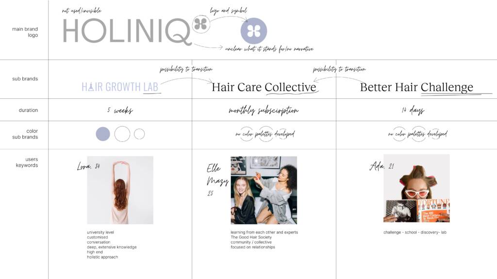
HGL offers holistic programs for ladies who want to improve their hair quality. Students can choose from these based on their level of investment, timeline, and goals.
Coming onboard the connection between these curricula was as unclear to the audience as to me.
For starters, we identified the user personas and sketched out their interests, age, background, and learning style. Being clear about their expectations would help us serve them better. Their preferences would guide our strategic and visual decisions.
2. Finding a new name
HOLINIQ being the umbrella brand had little to no presence in any branding materials. Stumbling upon it it was completely disconnected from the study programs. Still being present on the web address and other communication materials invited me to clarify its position.
Creating a strong overarching brand carried a huge potential. If we do it right, it can become a name of a movement – unifying women being in charge of their health and hair. No matter the program or the level of investment. This strong presence allows us to connect the programs as well, creating visual and ideological unity. Thanks to this, the students can feel that they belong to something bigger.
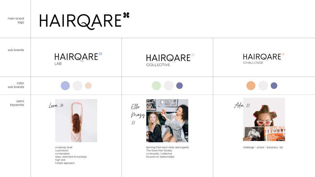
Brainstorming a couple of ideas, we landed with HAIRQARE. The name reflected the brand’s activities. Misspelling the word opened up the opportunity for the word to become a movement, that people can intentionally refer to.
Bringing the courses under this umbrella clarified their differences.
Renaming the company wasn’t just beneficial for prospective clients, but employees as well. It strengthened our belonging to this strong, mission-driven company – motivating us all.
3. Establishing brand guidelines
Once we knew who our customers were, it was time to appeal to them. This required defining the overarching visual identity while maintaining the difference between the programs. We started by allocating different color palettes to the programs.
The whole identity was built on the foundations of HOLINIQ’s former visuals.
The logo followed the established logic – keeping the clover/butterfly in the symbol. Holiniq was already putting the letter Q in the focus point. Keeping it as the symbol of the misspelling emphasized how Hairqare is doing things differently.
Typography! Always a hard one to nail. Luckily the aim was very clear here: great legibility across the website, potential app, e-books, study materials, workbooks, and cheat sheets. For body text, we settled with the versatile Inter family, combined with the elegant and quirky Reckless.
As mentioned before, the programs had their own color coding. Displaying them together, they still looked in harmony. While selecting hues, I needed to keep in mind that they will have to function on lesson slides, and videos, as overlays, gradients, and highlights. After all, they all needed to evoke a scientific, relaxed, and serene atmosphere.

A brand book is only a foundation of a brand. In our case, we needed to explore the visual language of the brand much further. We needed to figure out ways that can work on multiple branded mediums, displaying photos, illustrations, text, highlighting, and quoting sources.
The result: a balanced look, supporting on a scientific basis, borrowing elements from a hand-highlighted worksheet known from our study days. These elements made the whole material more relatable to the students, allowing them to feel vulnerable and supported during their studies and lifestyle changes Hairqare inspires them to do.

Documenting the visual and strategic rules in the brand book helped the company approach external web design companies and copywriters with more clarity. Onboarding new colleagues became easier as they could get a brief look and feel of the brand by studying the brand book.
When in doubt, or while creating new templates we could always refer back to a common document – easing decision-making and avoiding misunderstandings.
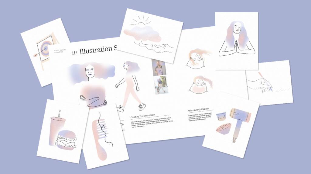
4. Illustration style
HAIRQARE publishes a wide range of educational materials. Some of the terms or concepts are hard to refer to with a photograph. We needed a tool to have simplified, easy-to-explain scientific material that still connects to the audience.
The drawings contribute to the atmosphere of the presentations, are supporting definitions on the workbook pages, grab attention on social media posts, make understandable infographics, and highlight posts on the website.
Establishing a unique illustrative style fitting the visual style made the brand’s communication material more uniform, unique, recognizable, and relatable for the students.
Since the style is quite minimal, it fits across the application cases well. The fine lines can be used precisely in infographics, but do well in curling lines and mood-evoking artworks too. The fills are airy gradients mixed and fit to shape from the brand’s colors.
Once we locked in the style, hundreds of artworks were created to fit a variety of materials.
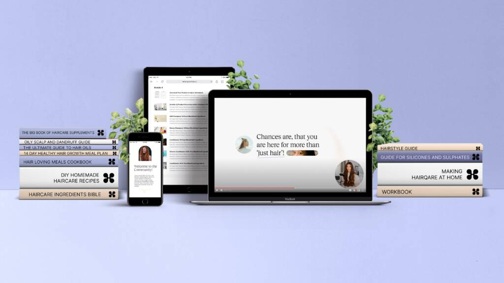
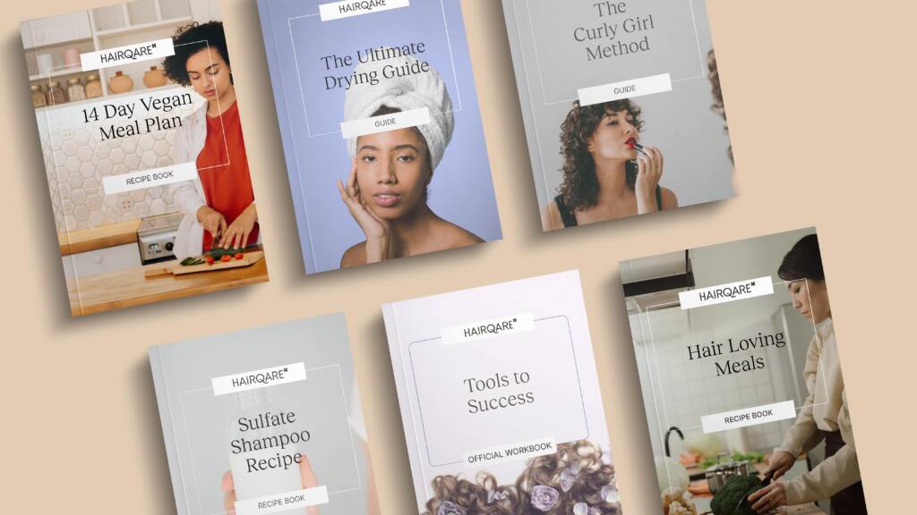
5. Templates, presentations, books and leaflets
The next stage of the rebranding was finally making use of the framework we established. No matter how professional the course presentations were, their looks hindered their success. They needed to be more scientific, more uniform, and more structurally thought-through to be taken seriously. With these aspects in mind, we developed templates, and slowly translated all the lesson presentations to these.
The result? Enjoyable slides that are well illustrated, assembled, legible, and easy to note.
Hairqare’s books and publications required similar treatment. The high-quality content needed a bit of a visual facelift to fit the rest. By updating the templates, adjusting the brand colors, working with the new typographic rules, and applying the photographic guidelines the books got a radically different look with minimal intervention.
6. What I learned from this project
I was brought on board to orchestrate this rebranding as a contractor. Very quickly I integrated into the team and took my role seriously as a design lead. I had to make sure that all teams are on the same page about the brand’s development. Their questions and our brainstorming sessions brought me to test aspects of the brand I haven’t anticipated before.
Educating and providing feedback to my small but mighty design team put the brand book to the test as well. We worked with quite tight deadlines – and without good communication and a solid framework hitting our goals would not have been possible.
The flexibility of the leadership team and the adaptability of my colleagues made this complex, difficult rebrand a success story.