
A restaurant with a fusion of ideas
Chopstick District is a hip, delicious, Asian-fusion restaurant in Amsterdam.
They approached me to shake up their brand and make it even more out there.
Their previous identity was one of the many Asian restaurants. Red, black, and gold, high contrast, slanted letters, a well-proven visual wink to the East. And of course, the waving cat.
Going through their brand strategy, we figured out how much more they are than just your neighborhood Chinese Takeaway.
Ch.D. repurposed ingredients from other restaurants thought ecologically consciously about their packaging and contributed on a social level too. Other than that, there was always upbeat music and a really colorful atmosphere in the background of the calls with the owner.
Long story short, we needed to add the same inventiveness and energy to their visual identity.
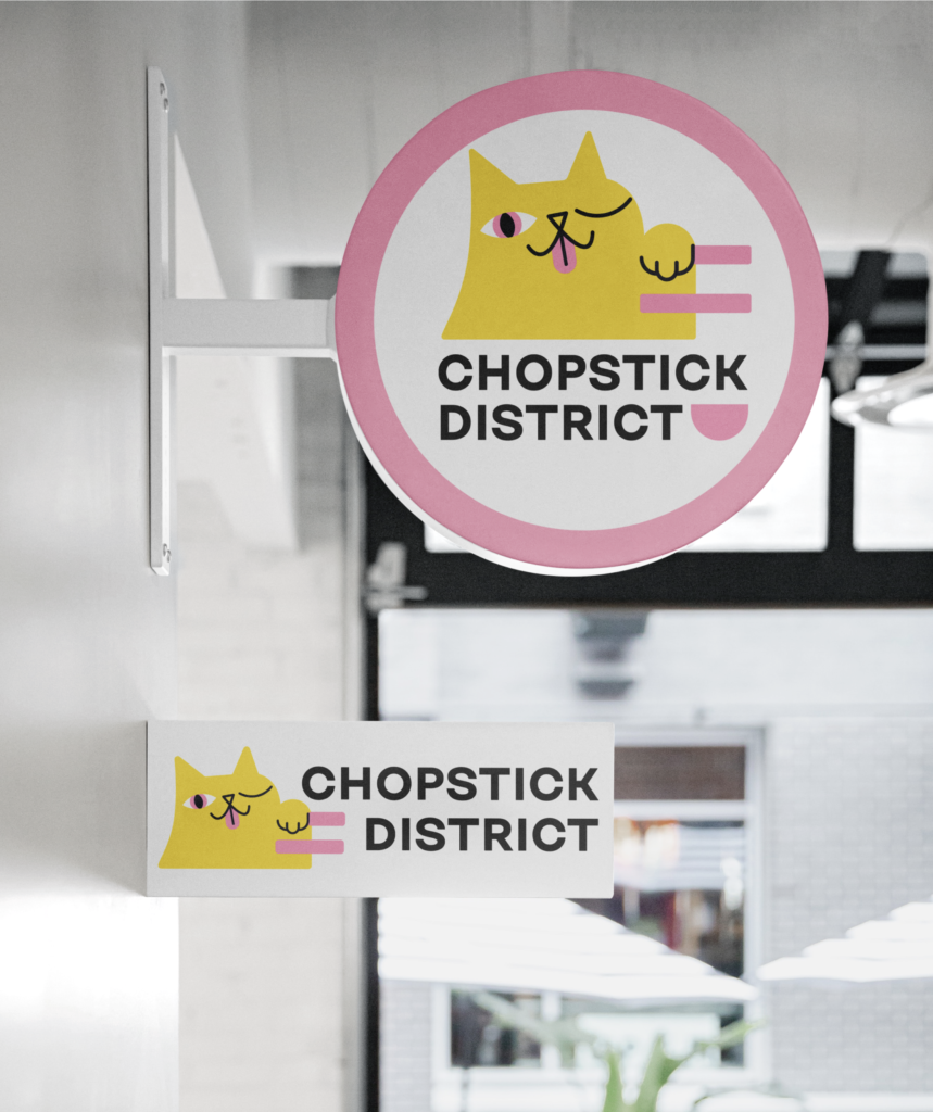
Remember the waving cat? The traditional Neko seemed to sit very deep in the heart of the brand. We chose her to be the brand mascot – and carry the connotation of the East to the logo.
To convey the same cheekiness and creativity, I spent a significant amount of time nailing the expression of the cat. Body position, facial features, and props were carefully considered in the first round of sketches.

Having many options, in this case, was a good thing. We carefully walked through all the sketches, describing them with emotional and suggestive terms. This exercise helped us narrow down the main expression of the brand from a kaleidoscopic and layered image to a concrete feeling. Once we found it, the logo was everywhere!

Developing the rest of the identity was an act of balancing between having an Asian atmosphere, mixed with the buzzing and fresh Amsterdam vibe.
I used a font reminding me of Asian scripts, because of the bold ‘strokes’ and because every letter could be included in a block.
Nailing the color palette of course had a huge influence on the perception of the brand. The previous high contrast colors were out of the question – they would have ruined all our efforts to take some distance from the conventional solutions of similar restaurants. I ended up researching the color palettes of different restaurant chains. Noticing some patterns, it was easier to choose a palette constituted of less-used colors. Fresh yellow, brisk pink and wakame green put the last vibrant bit to this brand.
When a logo becomes a mascot
Usually, brands are much more than their logo. I always advise my clients to stand on many legs when it comes to their visual identity. Use their color palette, typography, and logo consistently and creatively on their different communication materials. Like this they can build long-term brand awareness – and their customers will be able to recognize them even if they don’t have their logo on every. single. thing. printed. in. big.
It was no different with Chopstick District. However, their logo was so potent, that we ended up relying on its strength during our long-term collaboration.
Their brand pattern, for example, was a deconstructed version of their logo, creating a ‘Neko-soup’. Translated to a wrapping paper it brought some fun with the delivery bag during the challenging pandemic months.

A cross-cultural illustration style – featuring Neko the Cat
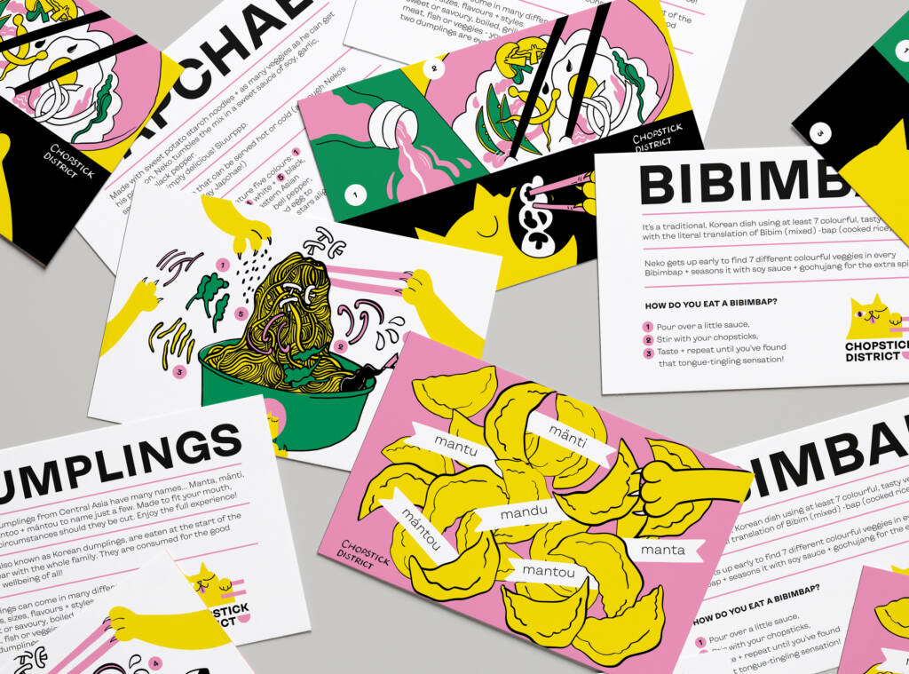
Promotional material has never been so spicy! CH.D owner, Vincent realized, that most of their customers like their food – however, they don’t really know what they are eating.
Delivery being the main focus of the restaurant, we opted for postcards to attach to the meals.
Inspired by Asian comics, brush style, and composition, I called Neko to life. Narrating the otherwise boring nutritional info through him made it more digestible to the lucky eaters – pun intended.
The main challenge with this project was to find a visual balance between East and West, respective of both, expressing precisely defined impressions of both sides. In doing so, we did not just convey their brand vision and mission but succeeded in bringing the energy, vibe, and emotions of this place to the heart of their identity.
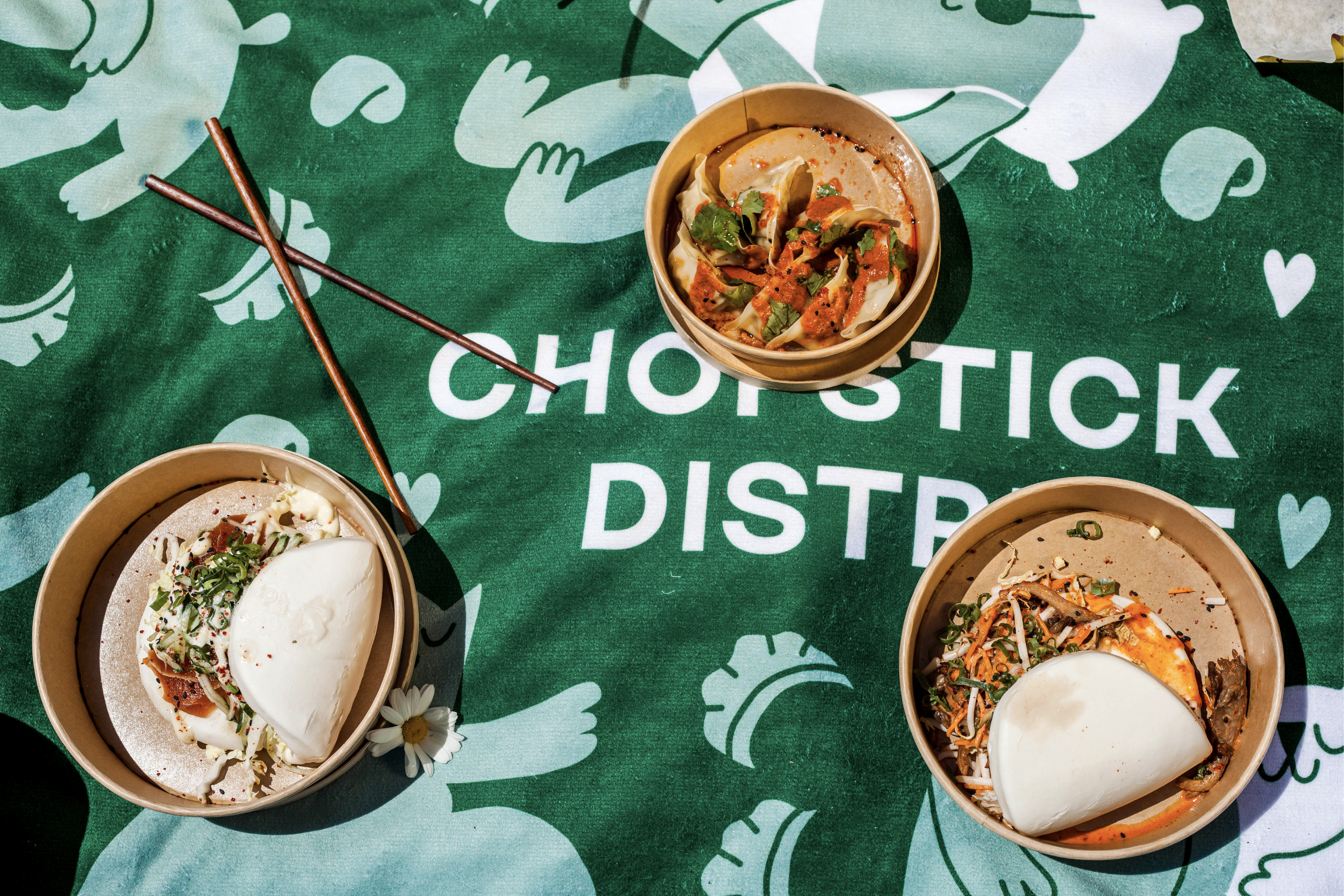
Chopstick District keeps growing, and our collaboration brings many new ideas to fruition. The latest? This beach blanket is produced from recycled fishnets and their amazing menu!