Aja Labs creates sustainable plant-based synthetic consumer fibers and materials. Their new identity contributed to broadening their reach.
Following the rebrand, they became more visible and more professionally considered in front of investors and stakeholders. Stepping out of the developmental phase, they were ready to tailor their brand to the new demands they were facing.

A rebrand is a layered task. We had to take their whole history and transformation into consideration.
During their strategy session, we first outlined their vision and mission. Based on that, we formulated their brand narrative. Even a B2B business needs an ideal customer profile. Relying on their expertise in their business, we could focus on who they serve. Informed by that, we could hone into a tone of voice that addresses the right businesses.
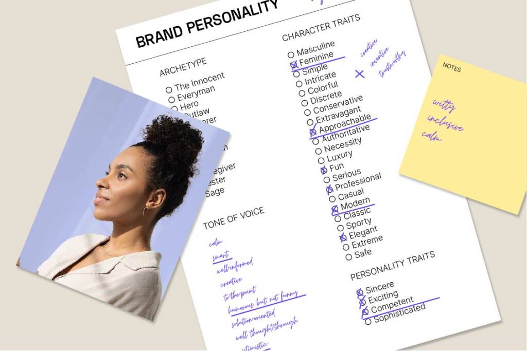
Building a brand personality is always helpful before continuing with the design phase.
We got to highlight the character traits of this brand persona. This helps later on when creating material that is relatable and targeting their customers.

Deciding between visual concepts is easier when thinking of the elements discussed during the strategy workshop.
These first concepts often confront the founders. The individual sketches highlight different aspects of their business. This is helpful when aiming to find a sharp focus.

AJA LABS moved on with a direction emphasizing their material.
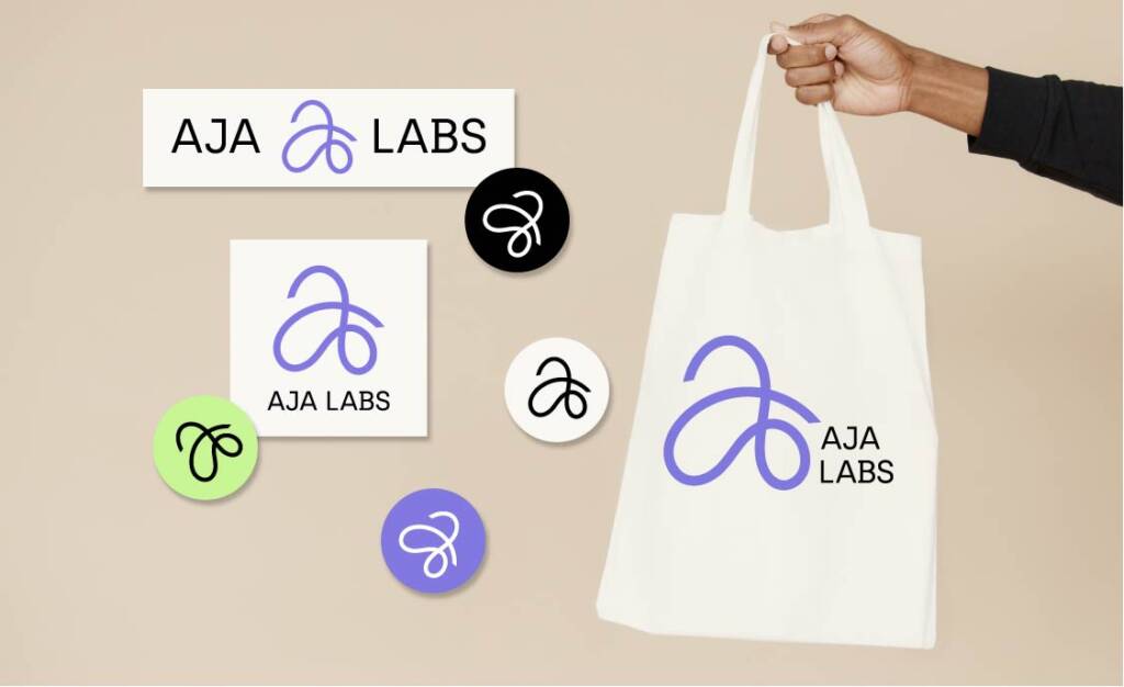
A single thread – refers to a fiber used in endless applications, and it’s dynamic appearance that signals motion and movement.
Their symbol is a simple, calligraphic solution.

To add a scientific approach to the bag, we opted for clean typography. The curves of the symbol and the simplicity of the text contributed to a clean, yet flexible and feminine whole.

The color palette has an emotional and psychological effect. We pivoted from their previous solution – being perhaps a bit too vivid for their newly established mood.
AJA LABS is green – plant-based, inventive -, lilac-feminine, and somewhat artificial.
The contrast colors are simply black and white – as to pull the scientific, laboratory brand together.
The brand’s expression is minimal. The elements play together to be a serious, yet approachable whole.


