
Celery Health is an expert-led digital health platform where patients can get information and help regarding their hormones, digestion, sleep and fertility status. Serving multiple areas, Celery provides a holistic overview, connecting possible parallel health problems. By doing so they help their customers proactively prepare for the future.
Their brand had a clear goal to be relatable and scientific.
The identity needed to bring together many aspects of their client’s health.

We started off with a workshop. We unearthed their goal, outlined their mission, and sketched up their vision.
Dealing with clients with sensitive information, we dove deep into their feelings, fears, and preferences of them. By doing so we could make a plan for how to establish trust through the brand’s communication.
It’s always exciting to define the brand’s personality.
During an interactive exercise, we create a person, that represents the brand.
Thinking of a brand as a person helped us (the founders and me) have a whole, rounded image of the brand. Using a metaphor of the person helps us look at the brand on a more abstract yet relatable way.
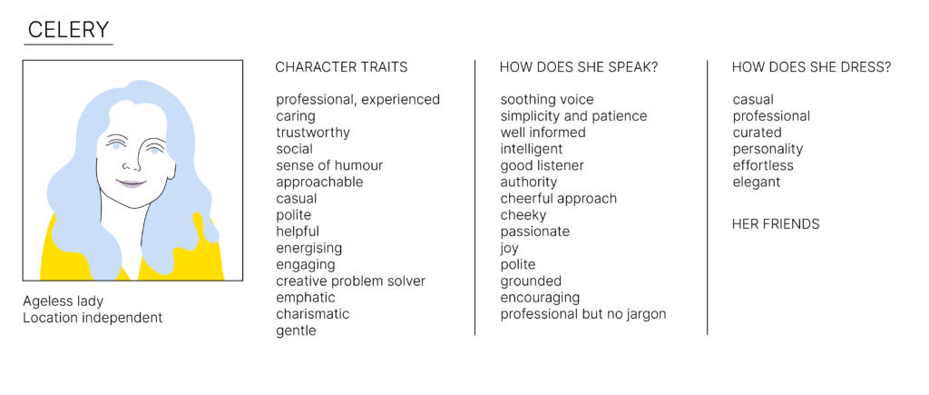
Giving words into their mouth, the tone of voice of the brand becomes clear.
‘Dressing up’ the brand personality was the next stage of the project.
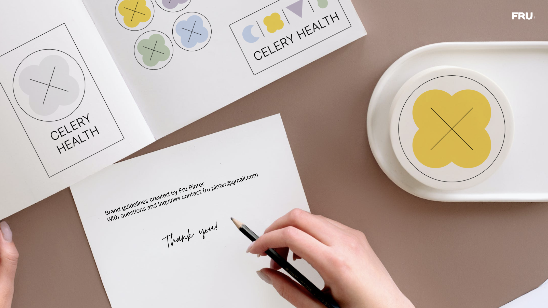
After going through a couple of sketches, we settled on a brand that was aligned with Celery’s values. We needed a versatile system whereby the elements work separately as well as together.
(Add explanation of the elements)
The elements coming together in the logo have their separate meaning. This comes in handy when using them for the individual health areas Celery is serving.
United, they make clear that Celery is representing a holistic approach when it comes to tackling health and specifically fertility-related topics.
The logo also looks like particles (e.g. hormones) observed under a microscope in a Petri dish.
When designing the color palette, the challenge was to introduce color that keeps these somewhat anxiety-inducing health topics light. We opted for pastels to avoid a childish touch and introduce softness and a notion of a caring environment. The dominant white space and the fine lines ensured that the brand is still seen in a clinical, yet not too medical context.
Celery aims to bring the holistic knowledge they have about overlapping health concerns in an understandable and relatable way to their clients.
Based on their visual identity I created an illustrative system that seamlessly fits into it. Adding these artworks to their website didn’t just elevate its aesthetic appeal – but added value by bringing complex topics closer to Celery’s audience.